The Task
Some of the more fun and intensive projects from back in my school days was the rebrandings we had to do. One of my favorites was when we were assigned to rebrand a coffee shop from scratch. A few peers put up a fight, but after putting in some research on our assigned brands, we all had a pretty good idea as to what direction we each were going to take.

The brand I was assigned was Coupa Cafe, based out of Palo Alto, CA – pretty much in the heart of Silicon Valley. At first glance, they seemed to have a pretty strong brand and an even stronger following, so my work was cut out for me. As always though, there is room for improvement.
At the time, I was still living in Rhode Island. I had never even dreamed of living in California back then. This posed some issues, as there was limited photography, and it was tough to gauge the feel of the local area around Coupa Cafe’s busiest store.
The Results

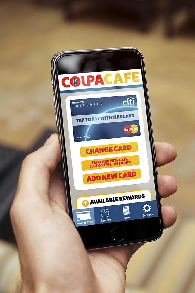
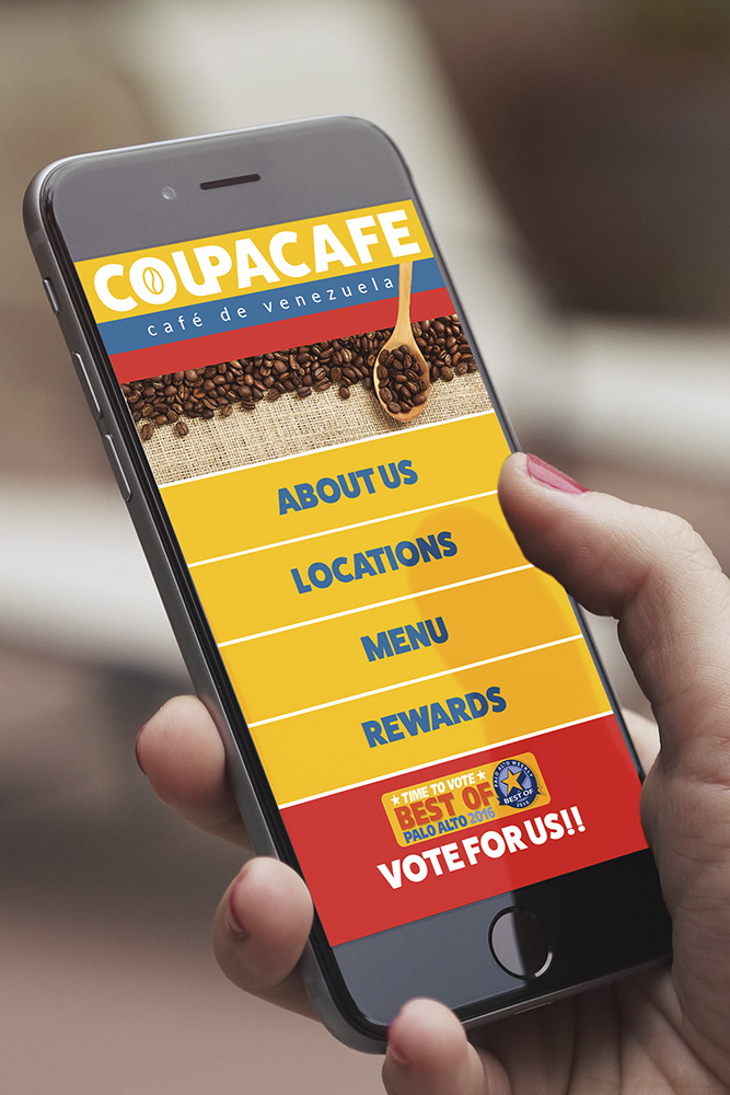
Go big or go home, right? I chose to go with a large, bold font and a bright and strong color theme. As explained in the book (link below), the colors were sampled from the Venezuelan flag, following the owners heritage. This new logo is meant to be easily recognizable from a distance, potentially attracting more customers who are walking the streets of downtown Palo Alto. The logo is also successful in all physical and digital productions, as seen below.

Lastly, we were instructed to make a print booklet detailing our design process throughout this rebranding journey. If you’d like to learn more about what went into this rebranding, please take a look at this link here (may open as a PDF in your browser, or ask permission to download the file)


