In a digital world, your packaging and printed material needs a bit more love to stand out. My print and packaging design will help elevate your position on the shelf, at the trade show, or anywhere in between.
Mobnetic Maxx redesign
Mob Armor // winter 2024
Objective
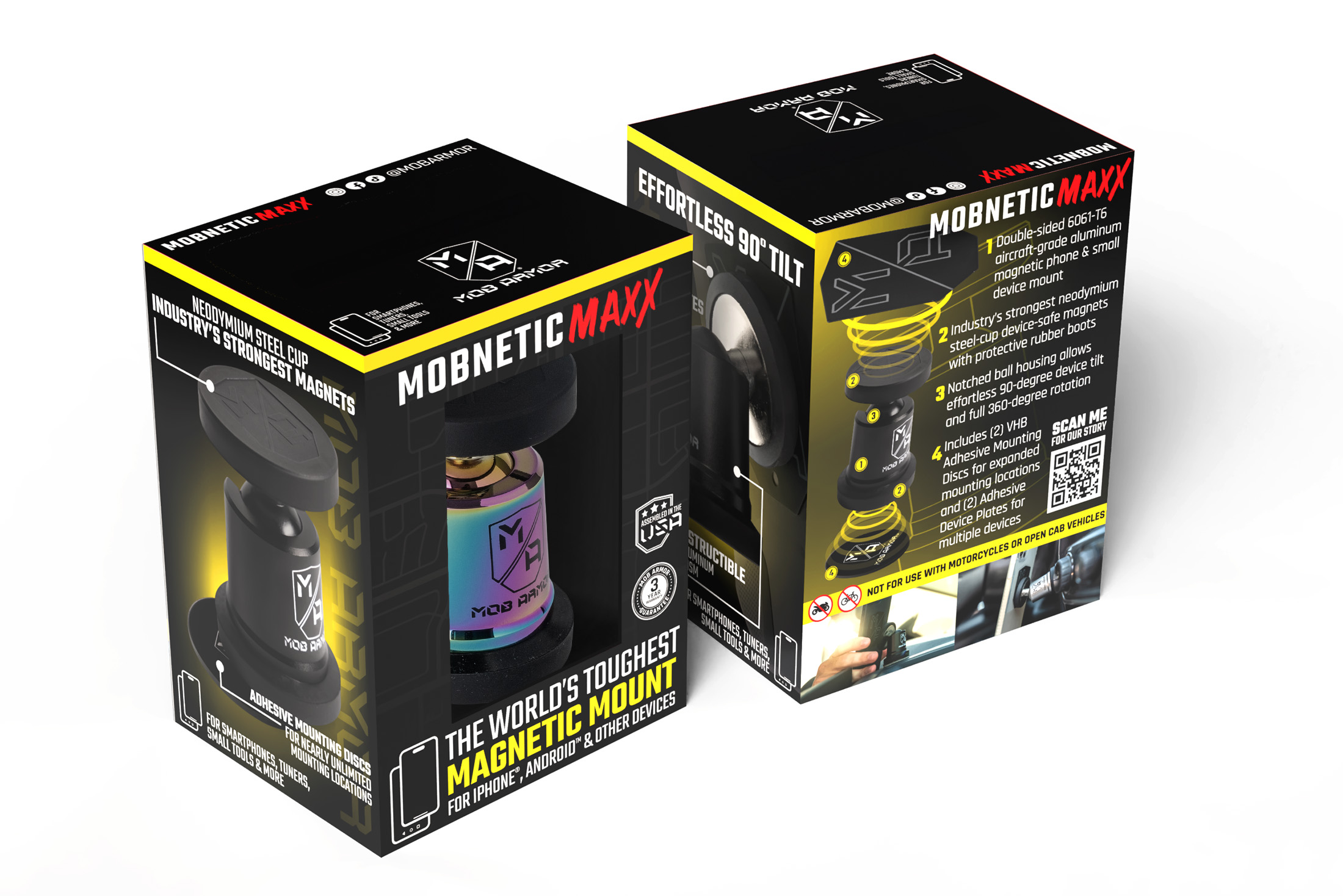
The top selling product for Mob Armor, the MobNetic Maxx, was in desperate need of a packaging redesign – for many reasons. By shifting away from a windowed folding carton to a far more durable rigid box, the product is now better prepared for shipping and storage – something necessary when making the move to a more D2C-centric business. While this new packaging elevated the overall experience of getting a new phone mount, it presented its own challenges in terms of design success.
The Process
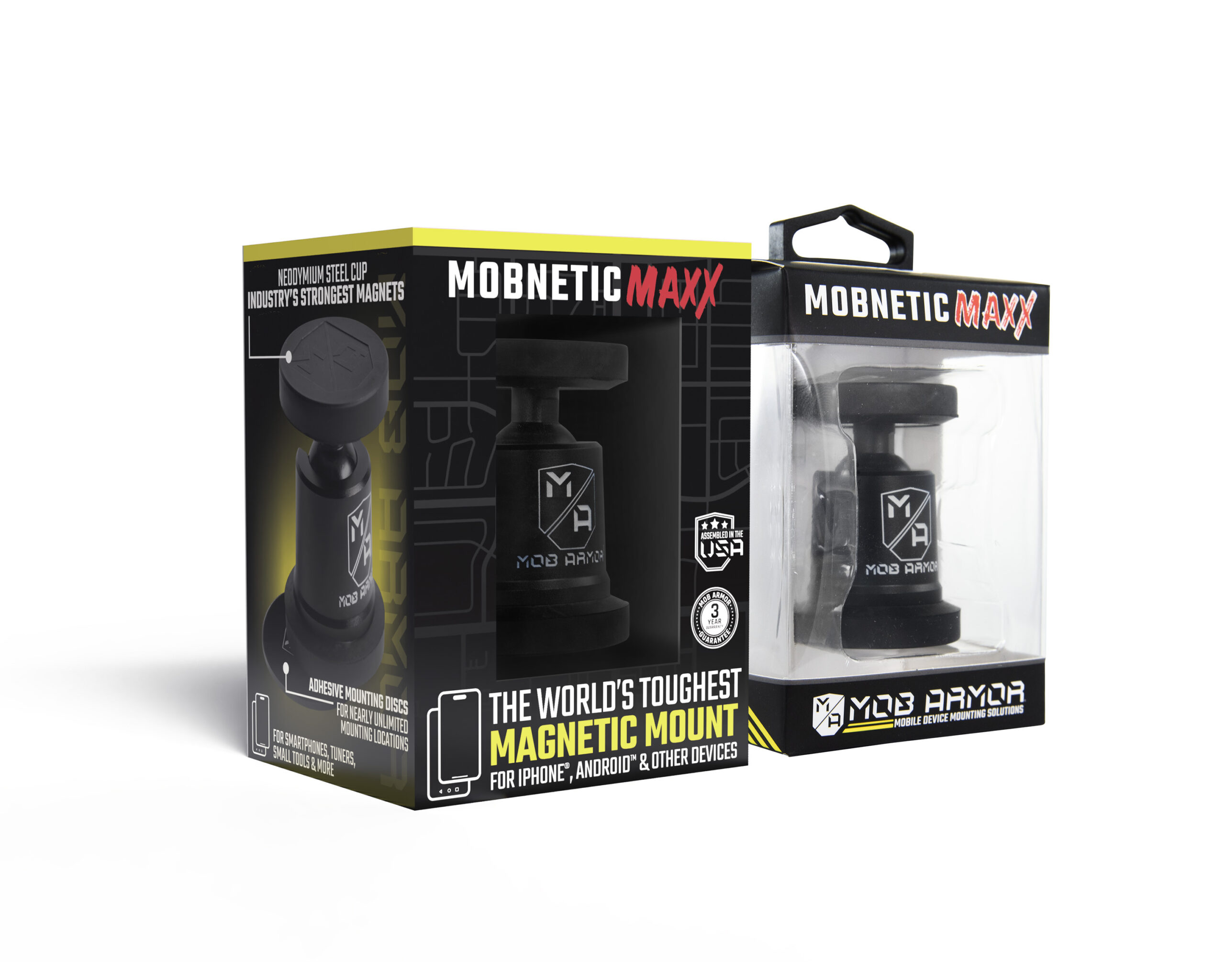
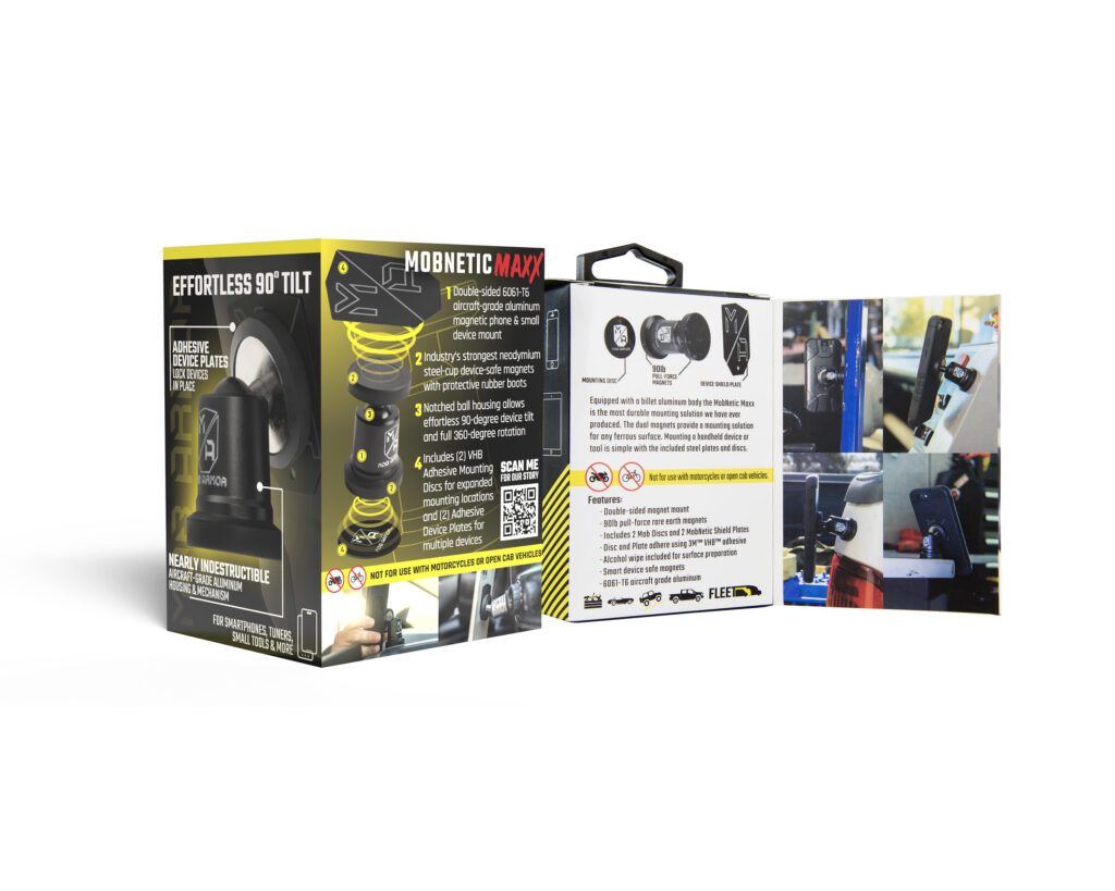
The longstanding folding carton design for the MobNetic Maxx provided the buyer with a 270-degree view of the product itself - something that became even more important as new colorways were introduced. While removing two sides to the window and only having one smaller front window on the rigid box, there was more real estate for describing the product - while also having less viewing area to let the product itself do the talking.
The additional space allowed us to take the design in a different direction from the original - allowing us to call out key features on a curated product image - and of course, do a bit of brand bragging. The end result is a higher quality, more informative package with an improved opening experience, lending to the fact that it is a premium product meant to last longer than any other phone mount.
You may also notice the lack of company branding on the front face of the package. After much debate, it was determined that the space was better used with product branding and taglines - the packaging will either be on a hanger, surrounded by other branded product, or shipping directly to the customer. Either way, the company branding will be prevalent elsewhere in the buying experience, not to mention right on the front of the product visible in the window of the box.
Tools used
This project was completed primarily in Adobe Illustrator, with Adobe Photoshop also being used to assist with imagery. Box drawings were designed and provided by the Mob Armor engineering team.
Branding Iron Jerky redesign
branding iron // spring 2022
Objective
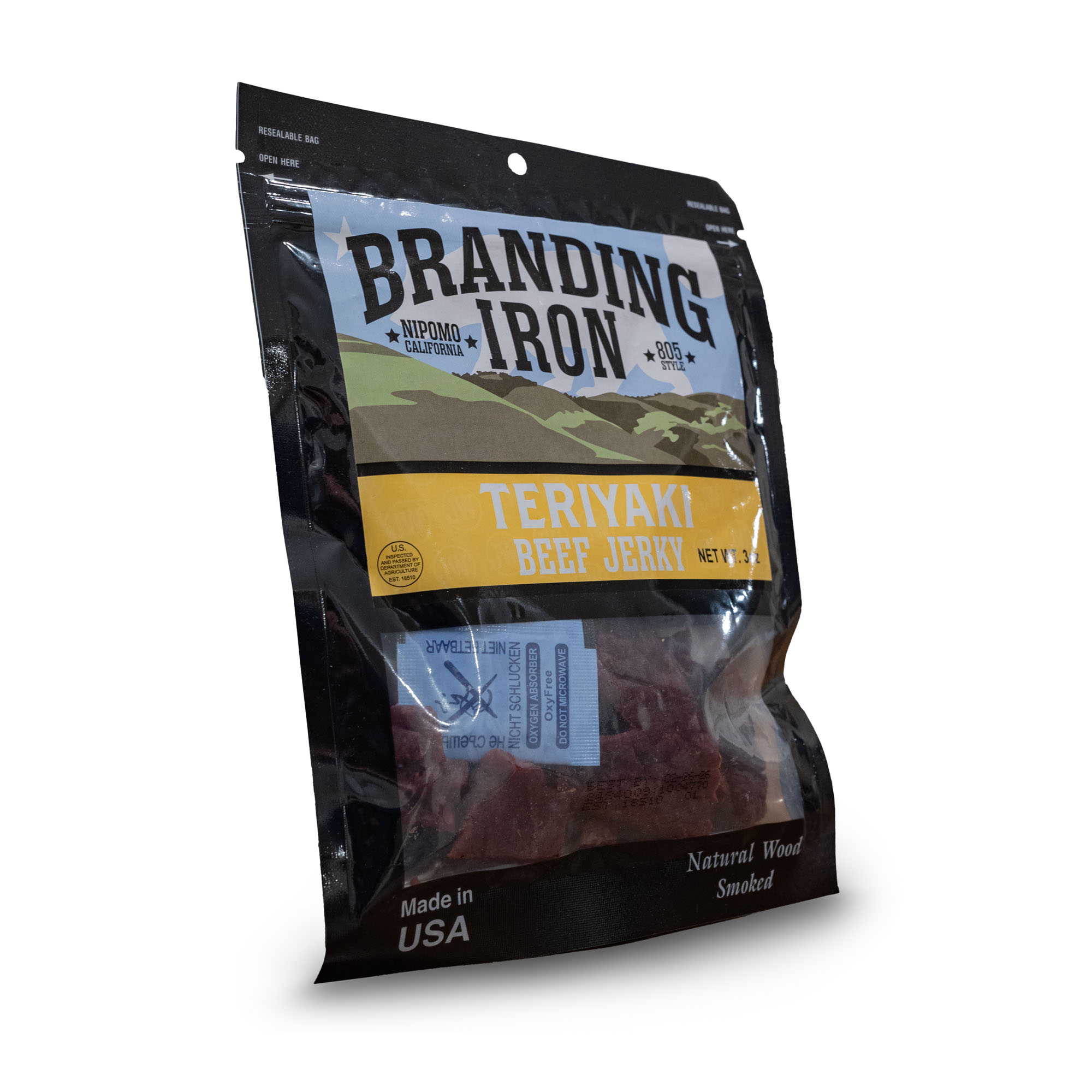
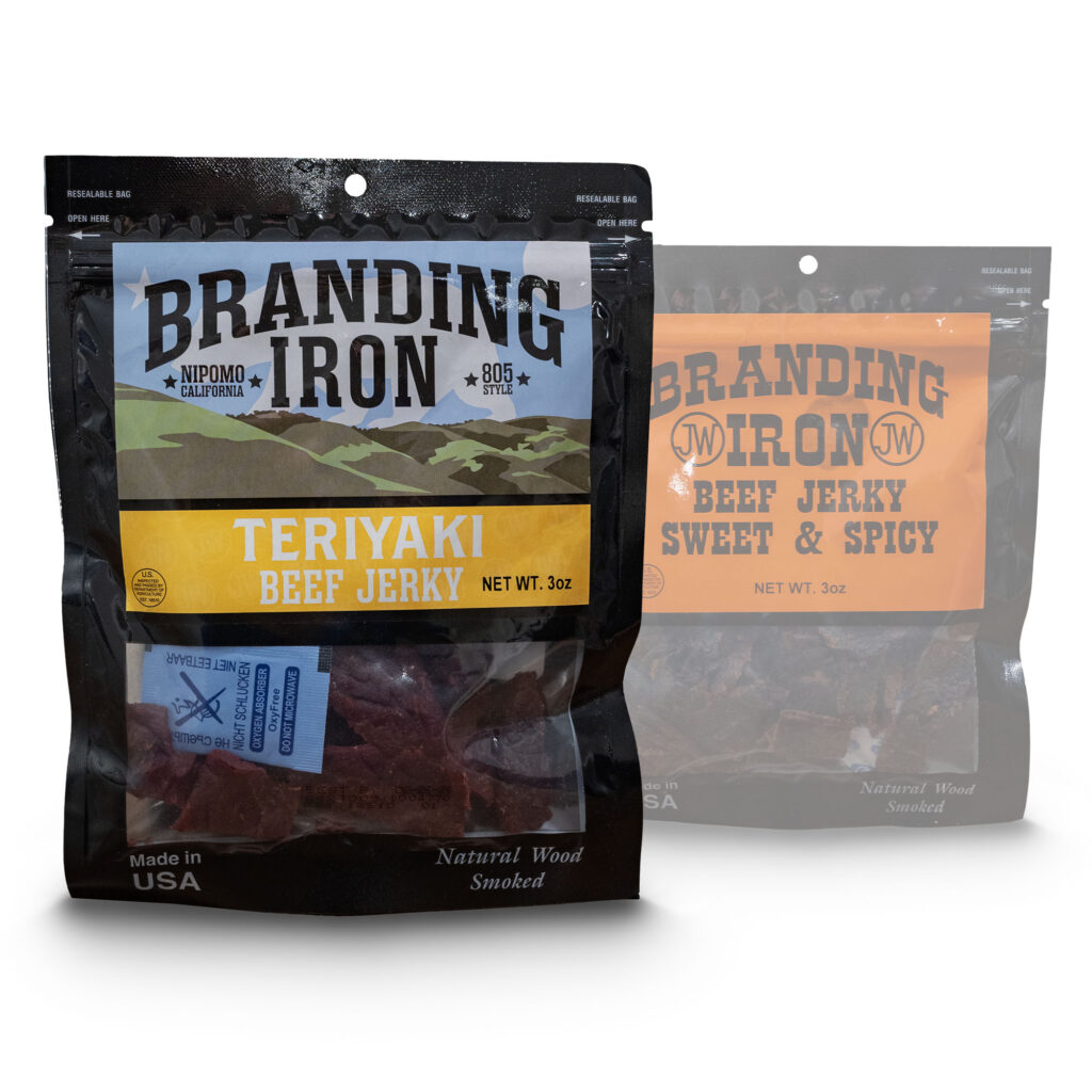
Branding Iron Beef Jerky, out of Nipomo CA, was in the process of expanding their distribution footprint, and needed a refresh on their packaging. With over a dozen different flavors and strong ties to the local community, the criteria for the new label was fairly straightforward – make it stand out, and make it feel like home.
The Process
The town of Nipomo is perched on a wide, windy mesa between two geographical opposites - the Pacific Ocean, with surf and dunes on its shore; and the rolling foothills of the San Rafael Mountains. For anyone who has had the pleasure of traveling the 101 Highway between Southern California and the Bay Area, the contrasty, almost perfectly evenly placed mountains to your east in this area are unmistakeable. Anyone from the area would recognize these hills as "home", hence the decision to make it the main theme of the label.
The splotchy groves of trees, grasses, and brush create an eye-catching pattern, while the soft blue California sky creates a contrast between the brand, and the numerous bright flavors beneath. While not immediately noticeable, the "JW" branding-iron style icon is patterned beneath the flavor - in line with the original duotone label.
Tools used
This label was completed primarily in Adobe Illustrator, and designed to be scalable with different size bags (3oz and 1.4oz).
Tinkle Toilet Trainers
Prince Lionheart // spring 2020
Objective
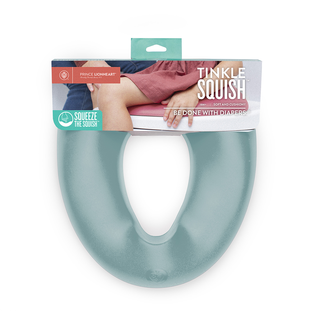
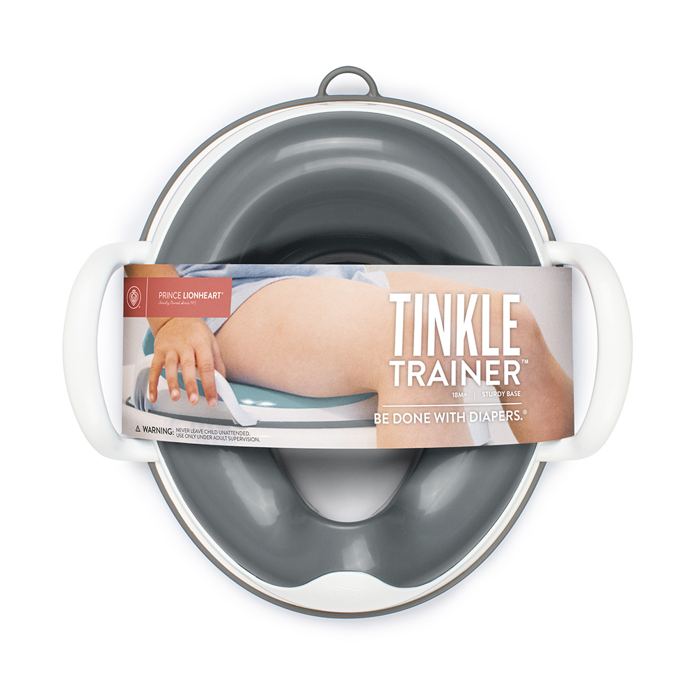
Some products you just don’t need… until you really do. Potty training is not an easy task (something I actually learned a few years after designing this), and picking out the tools to make that task easier isn’t any simpler. Prince Lionheart was in the process of releasing their new Tinkle toilet trainers, which were to be sold both brick and mortar and online. Building trust with nervous parents is difficult – so having as much of the product visible, and tactile, as possible was key.
The Process
Prince Lionheart is a proud family-run brand - proud of their roots, proud of their accomplishments, and proud of their products. They want to convey that pride in all of the products, with bold names and affirming statements meant to empower parents on their journey, just as much as the parents empower their children. While the product does the talking on the shelf, with consumers being able to pick it up and get a feel for it, the imagery and details on the packaging is used to create a sense of confidence and comfort - that you are making the right choice by choosing this brand, this product, this family. Should you pick this product off the shelf, the rear panel lists all materials used in the product, the story of why it was created (by a proud parent), and who can utilize it best.
Tools used
Packaging was completed primarily in Adobe Illustrator. Photographs were taken by me, with child models under parental supervision, and edited in Adobe Photoshop. Packaging drawings were created in unison with the product engineering team.
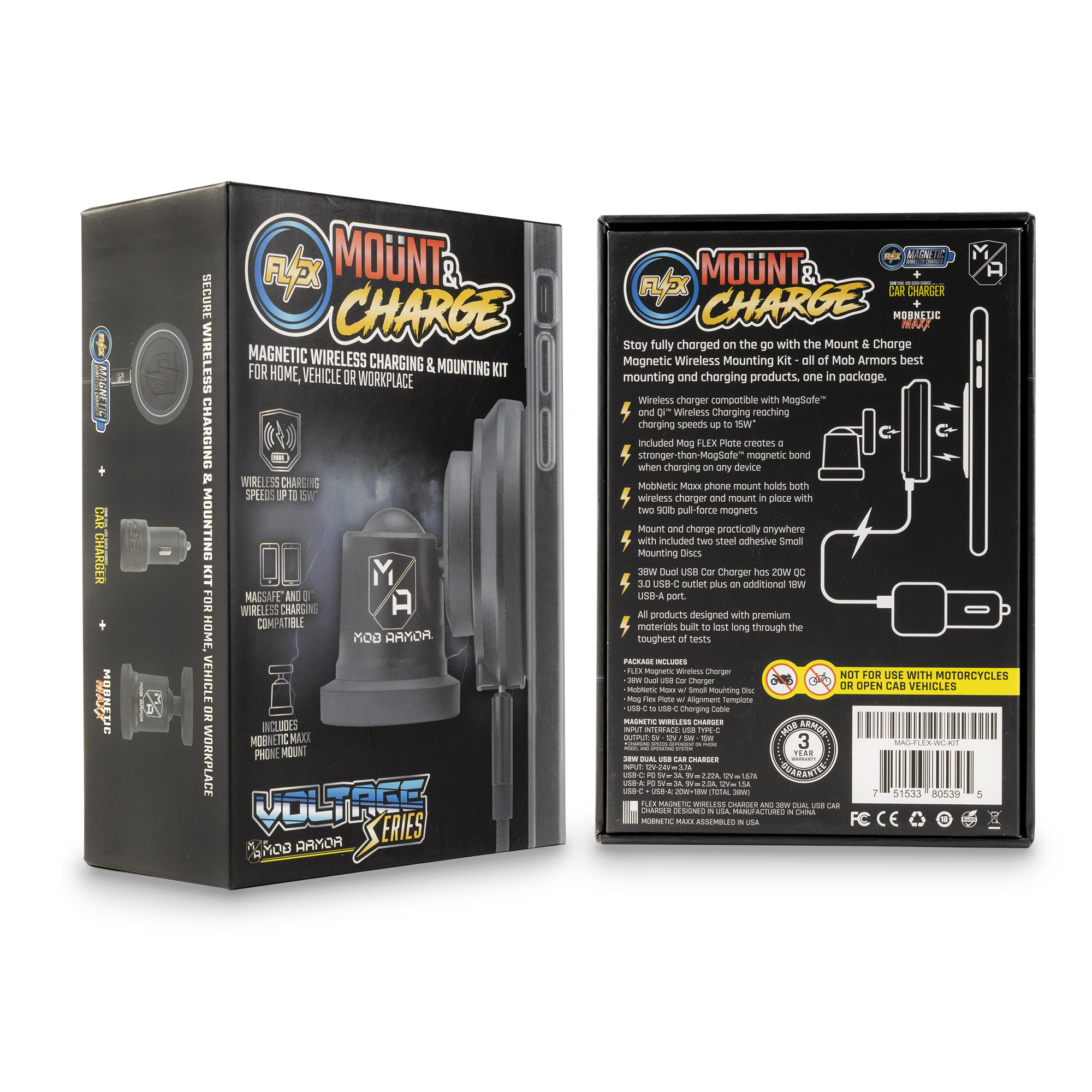
FLEX Mount & Charge Wireless Charging Kit
Mob Armor, a mobile phone accessory company based out of California, was branching into the wireless charging market and needed packaging and branding to go along with it (see below), built from from the ground up. The FLEX, Voltage Series, and product logos were meant to tie into original Mob Armor product branding, while also conveying a higher-end, rugged product to the consumer.
Designed for Mob Armor. Shelf and hanging product, designed with Amazon FBA storage and shipping considered.

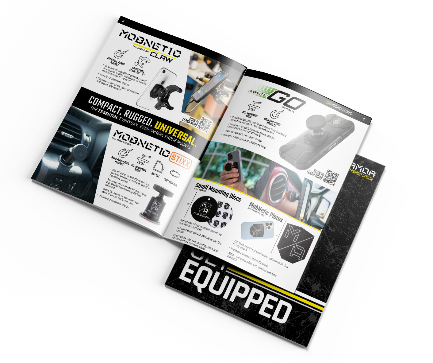
Mob Armor Product Catalog
With an ever-growing list of products for all sorts of industries and vehicle types, an all-encompassing product catalog was needed for Mob Armor. This catalog features dozens of products and accessories, broken into major and minor categories for easy navigation.
Designed for Mob Armor. 28 pages, plus cover, printed and digital. View full catalog here →
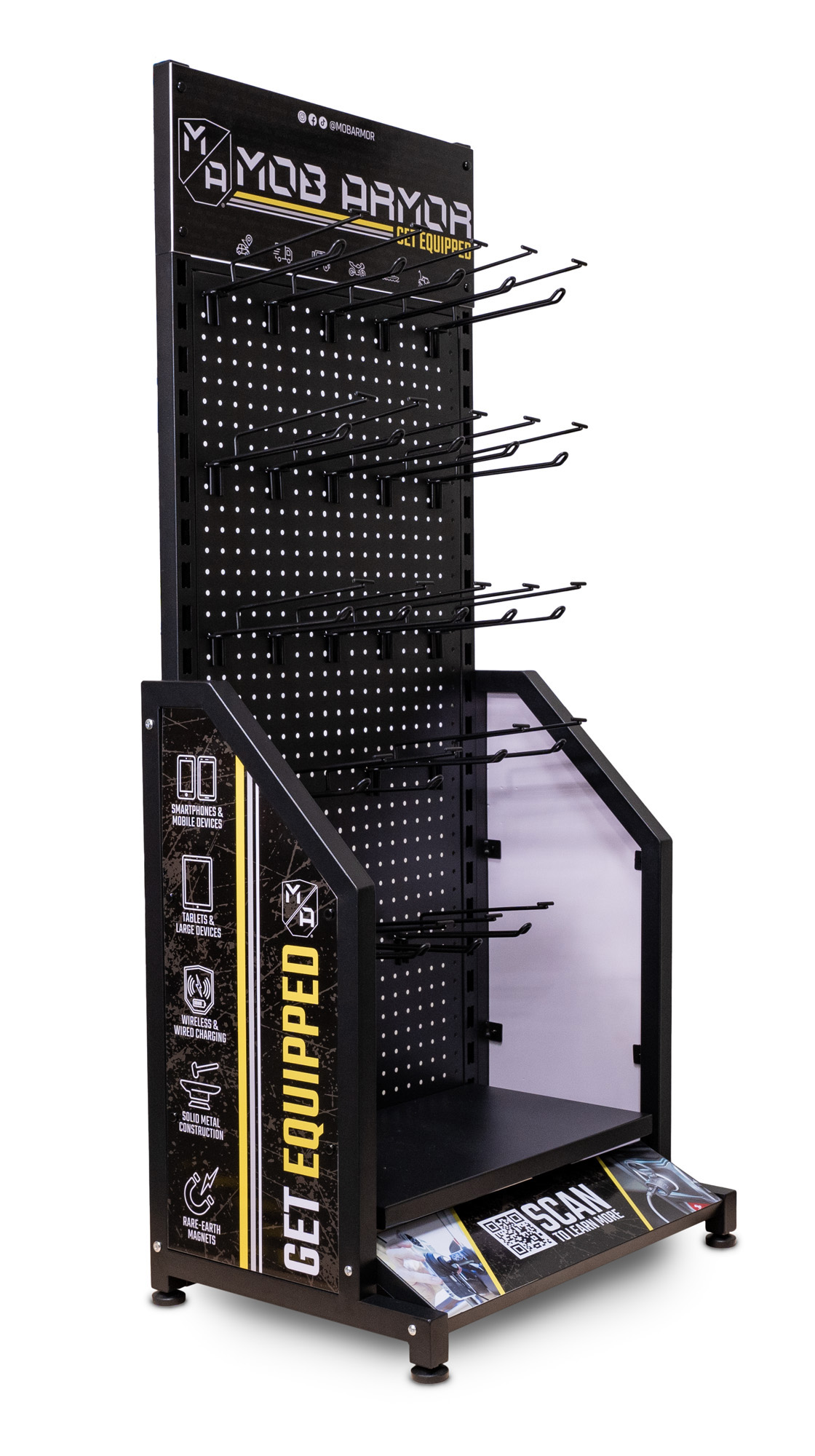
Mob Armor Sales Collateral
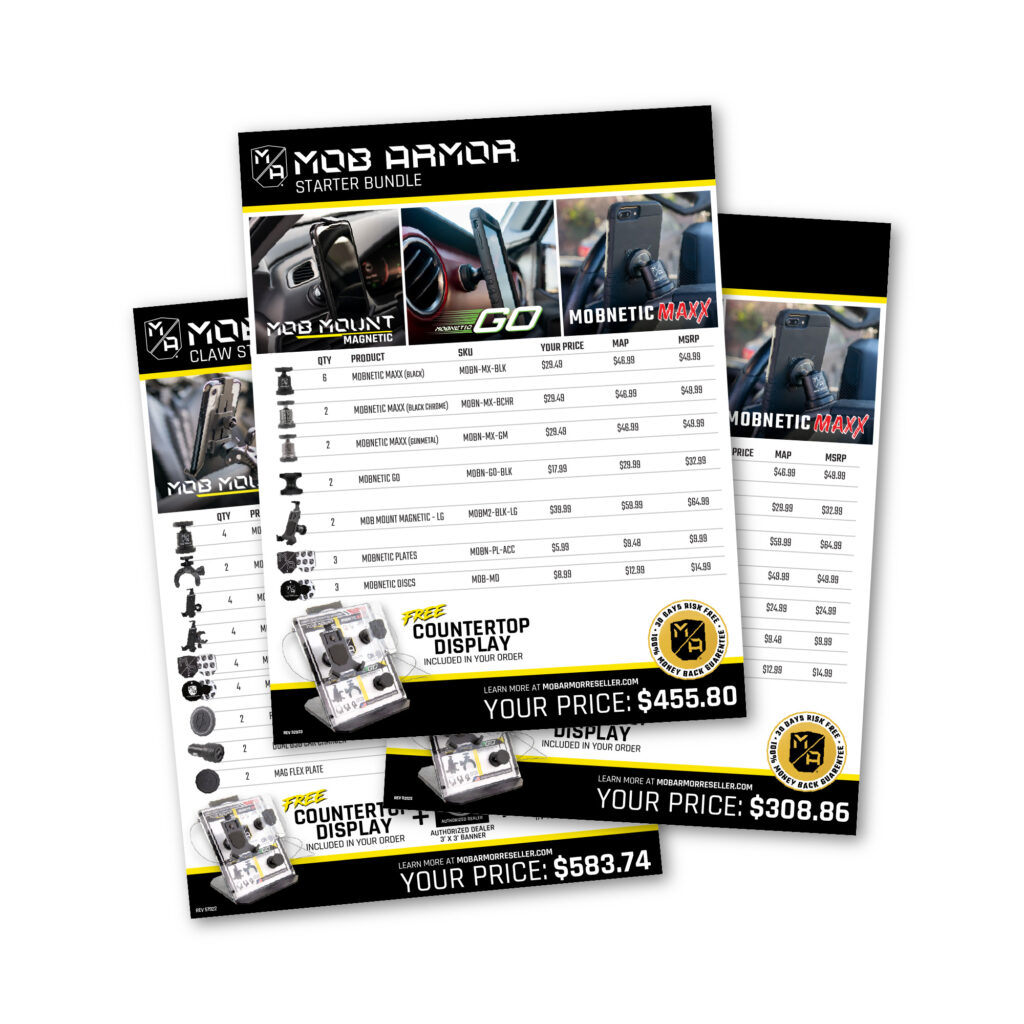
Much of my work for Mob Armor included developing both B2B and D2C sales collateral – from retail product displays, to product pricing and sell sheets. With these works often being a first or second impression on a potential buyer, sticking to strong branding and storytelling was paramount.
Designed for Mob Armor. Printed and assembled on a variety of displays, stationary, and digital product.
